OVERVIEW
Our client has provided Indonesia's leading food & beverage companies specializing Japanese delicacies as well as other selections of Asian cuisines. Successfully serving millions of foodies with keeping up the tradition of the best dining in a comfortable atmosphere with exceptional service
In the age where everything is digital, how might we establish an online presence that represents traditional dining and comfortable atmosphere with our loyalty program, Solva
MY ROLE
UI/UX Designer
TEAM
Lead UI/UX Design
Senior UI/UX Design
INDUSTRY
F&B
SaaS
Loyalty
SKILLS
Mobile Apps
Branding
Visual Design
Moodboarding
CONTEXT
MY JOB
Finding the sweet spot for visual art direction between traditional-luxury and prestige to represent traditional dining atmosphere
As UI/UX Designers, my goal is to create a reflection of their identity to communicate brand values to their customers.
The client is a food and beverage (F&B) business group, looking to build a loyalty program for their customers by offering special privileges. They need a loyalty program that supports their business and reflects their brand identity
It’s important to them that the loyalty program reflects their identity to communicate the value to their customer. This helps the brand's message and values are clearly communicated, building trust, attracting more customers, and increasing business
Create The Graphics Universe
Learn brand visuals to get an abstract representation to create a board of visual keys
Define The Overall Look and Feel
Defining the color system, typography, imagery, and UI style that embody the brand
Adding Visual Metaphors / Design Pattern
Create visual metaphors inspired by the brand's cultural elements to build a unique visual language

DISCOVERY
I started by understanding the brand's position, brand persona, style, restaurant style, through research, which helped me to find idea of the keywords for moodboarding
I looked at each restaurant's style, vibe, and location, as well as current design style in their visual communication like social media, poster, and website. This helped ensure that our art direction stayed aligned with their brand's, old Japanese luxury


CREATE THE GRAPHIC UNIVERSE
I collect, learn, and explore different design styles, fonts, colors, layout, and visual elements that would best represent to old Japanese luxury
Analyze the brand's existing visual language to identify recurring themes, shapes, colors, and cultural references, creating a foundation of visual keys for the design direction

ADDING VISUAL METAPHORS
With touches of black-gold I added the sense of luxury and prestige to enhance and giving the tradition dining vibe
To capture the essence of old Japanese luxury, I created a moodboard featuring traditional Japanese textures and iconic elements that evoke authentic of Japanese culture

To add a touch of luxury, I used thin borders on the buttons to create a more elegant and refined appearance

FINAL DESIGN
Combines a minimalist Japanese inspired layout with premium visual details to create an elegant and intuitive loyalty experience
A luxurious gold, black, and neutral color palette distinguishes membership tiers, while authentic restaurant photography, subtle Washi textures, and iconic Japanese elements reinforce the brand's characteristic. Clean layouts, bold typography, and strong visual hierarchy keep the interface focused and easy to navigate, delivering a digital experience that reflects the restaurant's premium identity

Create online experience that reflects the identity of the brand restaurant
Used aesthetic utility effect with real restaurant photo to capture the luxurious and traditional restaurant vibe

Incorporated Japanese elements
To highlight the traditional Japanese style, I added a minimalist Washi (和紙) texture for elegant and luxurious visual details
Incorporated iconic Japanese elements into the design to represent certain actions for context information

Minimalist layout inspired by Japanese design to help users focus on the important information
By keeping the interface clean and uncluttered, I created the UI elements stand out more, using contrast and bold typography to highlight the essentials
The app icon uses gold and black to give a sense of luxury and prestige to the brand app


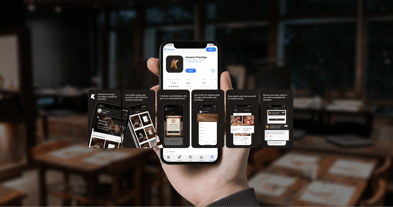
CONCLUSION
My process for finding art direction involves creating the graphic universe, defining the overall look and feel, and adding some visual metaphors to represent the characteristics
I collaborated closely with the client to translate their brand identity into a modern digital experience. To establish the visual direction, I explored a graphic universe to identify key visual themes and build a mood board, then defined the overall visual language through color, typography, imagery, and composition. After presenting several design directions, I refined the selected concept by incorporating visual metaphors that reinforced the brand's personality and created a distinctive, cohesive identity
WITHIN 3 MONTHS AFTER RELEASE, PRODUCTS DELIVED MEASURABLE GROWTH:
4.9/5
Apps rating
10K
Members registered